Stripes(): the border function you never knew you needed
As long ago as the year 2018, the CSS Working Group at the W3C agreed to add a new function to the border-color and outline-color properties. The function is called stripes().
The syntax is actually fairly simple. Let's say you want to make a blue and white border. All you have to do is:
border: 4px solid stripes(white, dodgerblue);Sounds great, doesn't it? A simple and effective way to make richer borders and outlines.
And it's particularly valuable in one very important use case: making a focus ring more visible. Being able to make a focus ring that is both black and white means it will be visible any kind of background colour.
'So how long has this been supported in browsers?' you may ask. The answer, sadly, is that it never has been.
Despite stripes() being added to the CSS Images specification almost six years ago, browser vendors have never supported it. I'm not even aware of how much interest they've shown towards it. One thing I can say for certain is that it's not coming to browsers any time soon.
What about the alternatives? permalink
One objection or compromise to the need for the stripes() function that I often hear is, 'Maybe you don't need it. You could achieve the same effect with just the box-shadow property'.
Well that's exactly what we tried at the BBC. A couple of years ago, we created a standardised focus ring design to use across our entire website. It is a 2px inner white stripe and a 2px outer black stripe. The colour order is inverted in dark mode.
When we first set out to build our standard focus ring, we decided to use box-shadow, since it supports a list of multiple shadows, and therefore we could use it to fake the effect.
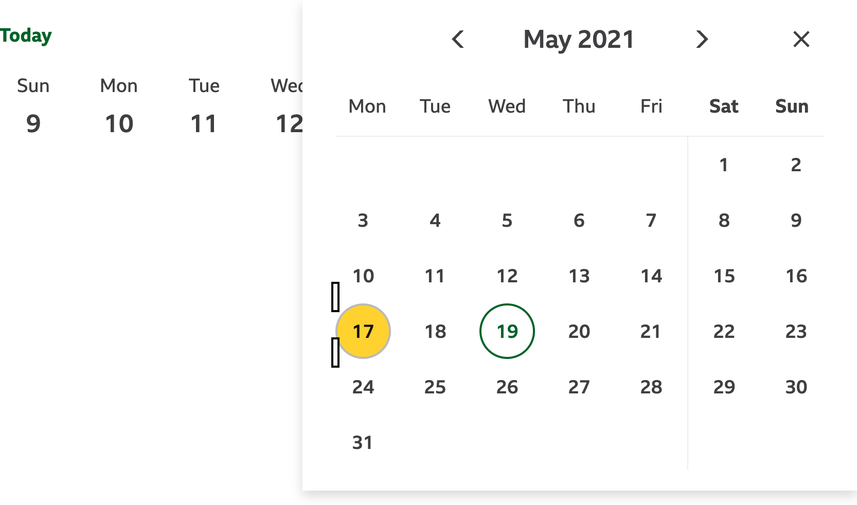
Here's a screenshot of the BBC's focus ring in action:

So let's see how it looks in Windows 11's high-contrast mode:

Oh, it's gone!
The problem is: in forced colours mode, all box-shadow properties are effectively disabled. So we couldn't build our BBC focus ring using box-shadow alone.
And there were other issues using box-shadow:
The
outlineproperty is really reliable for drawing a rectangle around some content – no matter the shape, whereasbox-shadowis not. For example, if the focusable element is an inline box, but the content inside it is in a block box, the shadow that gets rendered is broken up like in the example below. Theoutlineproperty does not share that issue.
Outlines and shadows are layered differently. Outlines are always on top, whereas shadows can get obscured by content overflowing out of the box and by surrounding content.

The
box-shadowcan't be offset. It must come out from the very edge of the box. If I want there to be a 2px gap between the edge of the box and the start of a shadow, that's not possible.
I'm quite sure focus rings are not the only use case for stripes(), either. There are, no doubt, many aesthetic reasons why it would be useful to have a border made up of multiple stripes.
A workaround permalink
As a workaround to the lack of support for stripes(), we had to use a mixture of outline and box-shadow. The outer stripe is the outline and the inner stripe is created by the shadow.
:focus-visible {
  box-shadow: 0 0 0 2px white;
  outline: 2px solid black;
  outline-offset: 2px;
}
This workaround works fairly well. In forced high contrast mode, while the shadow disappears, the outline remains. However, it falls apart when a focusable element on the page also sets a box-shadow, thereby removing the box-shadow used to create the focus ring. And there's not really anything you can do about that.
The stripes() function can save the day permalink
In conclusion, our users would all clearly benefit if we were able to use the stripes() function. Having it would allow us to make much more accessible websites for partially sighted users, keyboard-navigation users, while unlocking more design options as well.
In the world of web standards, you can write as many specifications as you want, but without interest from browser vendors, a proposal is unlikely to be supported. There are currently quite a few of unresolved issues on the CSSWG's GitHub repo around how stripes() will work, none of them are stopping browser vendors from expressing interest in supporting it. And with interest, there will be greater priority from them in resolving any issues that are blocking implementation.
You can show your demand for the stripes() function by 'starring' or 'voting' for the issue on the browser vendors' issue trackers. Here are links to the Chromium issue, the Mozilla bug and the WebKit bug.
I know accessibility may not be as exciting as mesh gradients or view transitions, but it's obviously a priority for all of us. So, web developers, if you want to see support for stripes(), please start banging the drum! Start talking about your own use cases and interest in it. With enough interest from web developers, the browser vendors will notice.