Mesh gradients in CSS
At the BBC, we recently had a brand refresh. It was known internally as the Chameleon Project. Done in partnership with Wolff Olins – who had done branding projects for the likes of Google, Uber and TikTok – its aim was to take the BBC out of its dusty old past of Gill Sans typefaces and a vast array of sub-brands designed around the world of broadcast TV.
We were moving into a new era: to be the world's first 'digital public service media' organisation. Our brand needed to represent the BBC's digital products at its core. And it did. It even won an award.
Beyond the new logo, most of the Chameleon Project only affected the UK. The BBC 'core brand' and each of our six core UK services: iPlayer, Sounds, News, Sport, Weather and Bitesize all got their own light and dark colour palettes and mesh gradients that we call 'ambients'.

© BBC
What are mesh gradients? permalink
Mesh gradients have become a popular design feature on many brands, including the BBC's. I think they look fantastic and can really add to a design. There are so many examples of them in use.
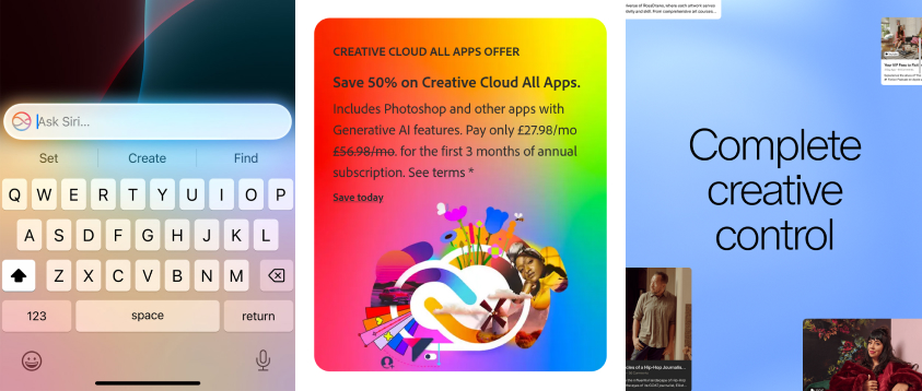
Images from Apple, Adobe and Patreon.
However, 'mesh gradient' has become a bit of a catch-all term. More accurately, what we're actually talking about are 2D gradients.
Until recently, the types of gradients that we've been able to use on popular design tools and the Web have been one dimentional. Think linear gradients and radial gradients. They let us specify colour stops along a single axis.
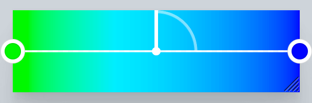
Screenshot of gradient.style by Adam Argyle.
But with 2D gradients, we can set colour stops on 𝑥 and 𝑦 axes. The colours are smoothly blended together over a 2D plane.
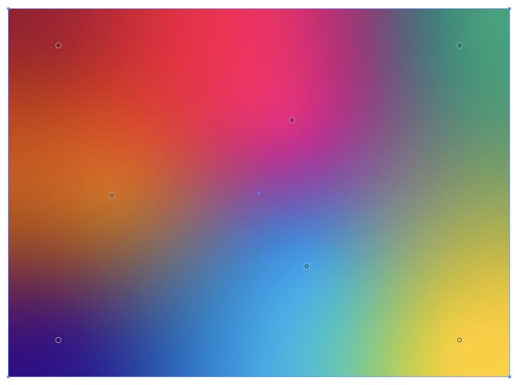
Example created in Adobe Illustrator by Ollie Buchanon.
2D gradients became popular when Adobe added support for them in Illustrator. There are two ways to create 2D gradients in Illustrator:
- Mesh gradients are created in a grid (the mesh). Colour stops can be added at the corners of the grid cells to create quite complex 2D gradients.
- Freeform gradients are much simpler to create than mesh gradients. Colour stops can be added anywhere on a shape. The colour stops don't have to be points; they can even be curved lines. Each colour stop can have their 'spread' increased to make its colour more dominant.
Bringing 2D gradients to the Web permalink
2D gradients currently aren't supported in CSS. Authors can either use a background image of a pre-made 2D gradient or try to cleverly overlay layers of radial gradients to create an illusionary effect.
On the BBC website, our 'Billboard' components create a mesh gradient effect by overlaying a mask of a mesh gradient over a single background colour. This allows us to create a kind of mesh gradient, but it doesn't let us mix different colours together.
I know at the BBC, we would love to be able to create real 2D gradients dynamically using CSS and I have no doubt many others would like to, too. It would enable us to create high-quality gradient images appropriate to the size of the box they are in, blending multiple different colours.
A proposal for 2D gradients in CSS permalink
Two years ago, I filed an issue on the CSS Working Group's GitHub repository to suggest a fairly simple syntax for supporting the type of 2D gradients that Adobe call freeform gradients.
The proposal is for a syntax like this:
background-image: freeform-gradient(red top left, gold 60% 40%, yellow bottom right %5);Like with any other CSS gradient, you could change the colour space that the gradient is interpolated in:
background-image: freeform-gradient(
  in Oklab,
  red top left,
  gold 60% 40%,
  yellow bottom right %5
);
The issue didn't get much attention initially, but after attending the CSS Day Conference in Amsterdam last week (which I highly recommend to any CSS nerds!), I was able to speak to some CSSWG members about how we could move it forwards, and it's been great to see some comments and shares on social media since then.
What now? permalink
Are you also interested in getting 2D gradients supported in CSS? If so, there's a number of things you could do:
- Share on social media this blog post or the GitHub issue. Maybe even write about it yourself! The more discussion we generate, the more browser vendors will see the interest that Web developers have for this feature.
- Share your feedback or any other use cases you have on the GitHub issue. Use cases help the CSSWG to understand how important the issue is and what problems it needs to solve. If you don't have anything to share, even a thumbs up 👍 on the issue helps.
The current proposal for the freeform-gradient() function provides only the most basic features of freeform gradients, so there's lots of feedback and bikesheading needed. For example:
- Is the name right? Is 'freeform gradient' just an Adobe term?
- Adobe Illustrator supports setting lines as well as points as colour stops. Is that something we want, too?
- Adobe Illustrator also supports increasing the spread of the colour stops. How would we specify that?
- Should freeform gradients be animatable?
There's lots of things that freeform gradients could do. But if this is a feature we want supported in browsers, I need your help!